In the fast-paced world of design, whether you’re working on a website, app, or print layout, creating a visually engaging, functional, and cohesive design is crucial. While creativity is key, the foundation of great design often lies in something simple but powerful: the grid system. This guide will take you on a journey to discover why grids are indispensable for designers, how they enhance your designs, and why you should embrace them in your next project.
What Is a Grid? Breaking Down the Basics
Let’s start with the essentials: What exactly is a grid in design?
A grid is a framework consisting of columns and lines that structure a layout. Think of it as the skeleton upon which your design elements—text, images, buttons, and other content—are positioned. While the grid itself is often invisible in the final design, its presence is critical for creating clean, balanced, and organized visuals.
There are three core components to any grid system:
- Columns: Vertical sections that divide your design.
- Gutters: The spaces between columns that provide separation and make the design breathable.
- Margins: The empty space around the edges of the layout that gives the design some room to “breathe.”
These elements ensure that every piece of content has a designated place, making the layout easy to follow and aesthetically pleasing.
The Psychology of Grids: Why They Work
Have you ever looked at a design and felt like something was off, but you couldn’t quite put your finger on it? Chances are, the layout was disorganized, with irregular spacing or uneven alignment. Our brains are wired to recognize patterns, and when elements are aligned and evenly spaced, we instinctively feel that a design is more balanced and visually appealing.
This is where grids come into play. They help eliminate the chaos by ensuring consistent alignment, spacing, and proportion, which appeals to our natural preference for order. When elements follow a grid, they feel harmonious, balanced, and easy to navigate—whether you realize it or not.
The Key Benefits of Using Grids
Grids are far more than just a design tool—they’re essential to creating effective and visually striking layouts. Here are some of the top reasons why grids should be an integral part of your design process:
1. Grids Keep Your Layout Clean and Organized
A well-structured grid acts like a blueprint for your design, guiding the placement of each element. This organization ensures that the layout remains visually balanced, with nothing feeling out of place. Whether you’re working on a print piece, a website, or an app, grids help you keep things tidy and aligned.
2. Grids Speed Up Your Design Process
The design process can be time-consuming, but grids help streamline your workflow. With a predefined structure, you don’t have to waste time deciding where to place each element. Instead, you can focus on content, color, and typography, knowing that the grid will handle the heavy lifting of organization.
3. Grids Help You Mix and Match Design Elements
In most designs, you’re juggling multiple types of content—text, images, buttons, and more. Grids help you integrate these diverse elements in a cohesive manner. For example, a baseline grid ensures that text is aligned evenly across the page, while a column grid makes sure that images and buttons fit seamlessly into the layout.
4. Grids Create Visual Balance
Balance is one of the cornerstones of good design. A grid ensures that elements are distributed evenly, with enough white space to prevent the layout from feeling crowded. Whether you’re working with a simple three-column grid or a more complex modular grid, this symmetry helps achieve a sense of harmony throughout the design.
5. Grids Make It Easy to Establish a Visual Hierarchy
Not all elements in your design should carry the same weight. Some pieces of content need to stand out more than others, and a grid can help you achieve that. By adjusting the size, placement, or prominence of certain elements, you can guide the viewer’s attention and create a clear visual hierarchy that directs the eye to the most important parts of your design.
6. Grids Facilitate Collaboration
Grids are a game-changer when working with a team. They provide a shared reference point for everyone involved, whether you’re working with other designers, developers, or content creators. This shared framework helps maintain consistency across the project and reduces confusion, ensuring that the final design looks polished and cohesive.
7. Grids Prevent Clutter
Grids help you avoid a common design pitfall: clutter. By defining consistent margins, gutters, and column widths, grids keep the layout organized and spacious. This results in a design that feels open and easy to navigate, rather than overwhelming or chaotic.
8. Grids Are Flexible and Adaptable
The beauty of grids lies in their adaptability. Whether you’re designing for a website, mobile app, or print, grids can be adjusted to fit the specific needs of your project. You can customize the number of columns, adjust the spacing, and tweak the structure to create a design that works best for your content and audience.
Types of Grids: Choosing the Right One for Your Project
Grids come in all shapes and sizes. Depending on the complexity and nature of your project, different types of grids may be more appropriate. Here are the most commonly used grid systems:
1. Manuscript Grids: Simple and Effective
This classic grid is perfect for long-form content, such as books, articles, and blogs. It typically uses a single column that spans the width of the page, allowing for easy reading without distractions. The simplicity of manuscript grids makes them ideal for text-heavy designs.
2. Column Grids: Flexible and Balanced
Column grids are the most versatile and widely used grid system. By dividing the layout into multiple vertical sections, you can organize various types of content—text, images, advertisements, and more. Column grids help create a visually harmonious design that is both functional and flexible.
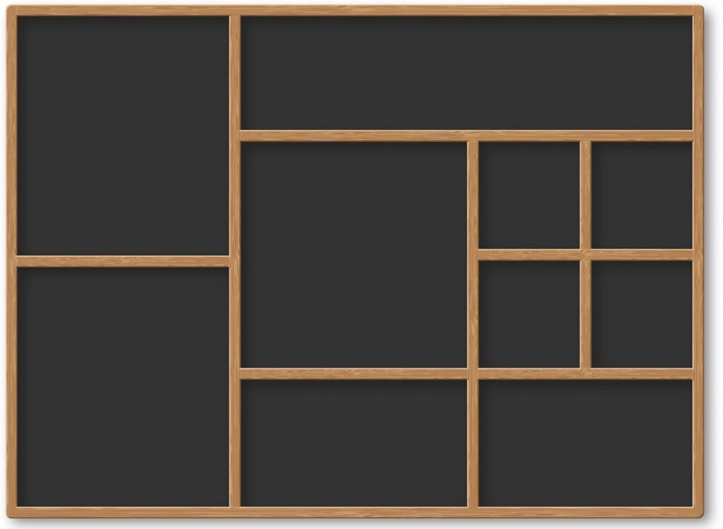
3. Modular Grids: Precision and Consistency
Modular grids take organization to the next level by dividing the layout into both columns and rows. This system is ideal for projects that require high consistency, such as calendars or complex web layouts. Modular grids help maintain order and precision, even when dealing with large amounts of content.
4. Hierarchical Grids: Creative Flexibility
Hierarchical grids break free from the rigid structure of traditional grids, offering more flexibility. This system allows for irregular sections and non-uniform layouts, making it perfect for creative or unique designs. Hierarchical grids give you the freedom to experiment with proportions and alignments while still maintaining order.
5. Baseline Grids: Perfect for Text Alignment
A baseline grid is primarily used for aligning text. It consists of horizontal lines that help maintain consistent spacing and alignment for text blocks. Baseline grids are essential for creating a clean, rhythmic flow, particularly in print layouts or web designs with large amounts of text.
Grids and Responsiveness: Adapting to Any Device
In today’s mobile-first world, responsiveness is key. This means creating layouts that adjust seamlessly across different devices—smartphones, tablets, and desktops. Grids make this process much easier, as they provide a flexible structure that adapts to various screen sizes.
Using breakpoints, designers can define specific screen widths at which the layout will adjust automatically. For example:
- Mobile: 320px to 480px
- Tablet: 481px to 768px
- Small Laptop: 769px to 1024px
- Large Laptop/Desktop: 1025px to 1200px
By designing grids that respond to these breakpoints, you ensure a consistent user experience no matter the device.
Breaking the Grid: A Creative Twist
While grids are incredibly useful, they don’t have to be rigid. Sometimes, breaking the grid can add dynamic interest and emphasize certain elements. This technique, known as “breaking the grid,” involves deviating from the structured layout to create tension or draw attention to specific areas of the design.
However, breaking the grid should be done intentionally. When executed well, it can lead to a visually engaging and creative design, but when overdone, it can cause chaos. So, understand the rules of the grid before you break them, and make sure the result enhances the overall design.
Conclusion: Embrace the Grid to Elevate Your Designs
Grids are the backbone of strong, organized design. They provide structure, clarity, and balance, making it easier to create layouts that are both functional and aesthetically pleasing. Whether you’re working on a website, an app, or a print project, grids ensure that your design elements are aligned and proportional, creating a cohesive user experience.
While grids are an invaluable tool for designers, they’re not the only option. Once you’ve mastered grids, you can experiment with breaking them and pushing the boundaries to create something truly unique. But no matter how you use them, grids remain a powerful tool in your design arsenal, helping you turn your creative chaos into a polished, professional result.
Embrace grids, and watch your designs fall into place—beautifully and effortlessly.